

Tick charts print a new bar after a fixed number of executed trades, while time charts print a new bar after a fixed interval like one minute or five minutes. Scalpers and intraday traders generally get more useful signals from tick charts because bars form around actual market activity. Swing traders and anyone relying on standard indicator settings usually do better with time charts. Either way, plan to recalibrate your indicators when you switch between the two.
TL;DR:
- Tick charts respond directly to trade activity, making them ideal for scalping and intraday trading where quick momentum signals are critical.
- Time charts provide consistent duration for each bar, which supports swing trading and trend analysis across multiple sessions.
- Indicators need recalibration when switching between chart types because traditional time-based settings do not translate directly to tick charts.
- Combining both chart types during a session improves decision-making, using time charts for context and tick charts for precise entries and execution.
Table of Contents
- Tick vs Time Charts: What Each One Actually Shows You
- Time Charts: The Steady Baseline Most Traders Learn First
- Tick Charts vs Time Charts Side by Side
- Matching Chart Type to Strategy: Pros, Cons, and Fit
- Starting Tick Settings by Futures Contract
- Recalibrating Indicators for Tick Charts
- Choosing a Chart Type: A One-Session Test You Can Run Today
- Practitioner Notes on Chart Choice and Automated Execution
- What Matters Most When You Actually Switch Chart Types
- Sources
Tick vs Time Charts: What Each One Actually Shows You
A tick, in market terms, is one executed transaction. It doesn't matter whether that trade was for one contract or five hundred. Each fill counts as a single tick, which means tick charts respond to how often trades happen, not how large they are. That distinction trips up a lot of traders coming from time-based charting, where volume and price movement often get conflated with bar count.
A tick chart forms a new bar the moment a preset number of trades has executed. Set a chart to 500 ticks and it prints a new bar every 500 executed transactions, regardless of the clock. During a volatile open, that might take 15 seconds. During a quiet lunch hour, the same 500 ticks could take 10 minutes. This is the core mechanical difference from time charts, and it's why tick-based intervals compress dead time and expand active time, giving you more bars exactly when the market is doing something worth watching.
The practical effect shows up on the screen immediately. When volume surges, tick bars stack up fast, spreading price action across more candles and making individual moves easier to read. When volume dries up, the chart goes quiet too, with wide gaps between bars instead of a dense stream of meaningless one-tick wiggles.
That behavior creates real advantages and real headaches:
- Reveals microstructure and momentum bursts that get flattened on a same-timeframe minute chart
- Filters out the slow, choppy stretches where nothing tradable is happening
- Timestamps mark the start of the first tick in the bar, not a fixed clock boundary, which matters when you're syncing tools
- Struggles on thin, low-liquidity instruments where bars can take an unpredictable and sometimes very long time to close
- Depends on clean, low-latency tick data, which not every data feed provides at the same quality or cost
Pro Tip: Check your data provider's tick-data plan before committing to a tick-chart strategy. Some feeds throttle or aggregate ticks during high-volume bursts, which quietly changes your bar count and can make backtests unreliable.
On instruments like the E-mini S&P 500, where trade flow is heavy and consistent, tick charts behave predictably. On a thinly traded micro contract or an illiquid equity, the same tick setting might leave you staring at a stalled chart for uncomfortably long stretches.
Time Charts: The Steady Baseline Most Traders Learn First
A time chart prints a bar every fixed interval, whether that's one minute, five minutes, or a full day, no matter how many trades occurred inside that window. A quiet one-minute bar and a frantic one-minute bar look the same length on the horizontal axis even though one might contain 50 trades and the other 5,000.
That fixed cadence is exactly why time charts remain the default across nearly every platform and why most indicator libraries were built with a time input in mind. A 14-period RSI, a 20-period moving average, or a standard MACD setting assumes a consistent number of price observations feeding it, and a time chart delivers that consistency by design.
Time charts earn their staying power for a few concrete reasons:
- Every bar represents the same duration, so comparing today's 10:00 AM candle to yesterday's is a like-for-like comparison
- Standard indicator settings, built and tested against time intervals for decades, behave the way traders expect
- Trend and swing analysis benefits from the steady rhythm, since multi-day patterns aren't distorted by activity bursts
- Cross-asset comparison is straightforward because a 5-minute bar on crude oil lines up in duration with a 5-minute bar on the Nasdaq futures
The tradeoff is that a time chart can bury exactly the information a scalper cares about most. During a fast, high-volume burst, an entire sequence of aggressive buying or selling can get compressed into one or two candles, hiding the internal structure of that move. Time charts remain the more consistent choice for swing and trend context, but that same consistency is what smooths over the sharp, tradable detail inside a fast tape.
Tick Charts vs Time Charts Side by Side
Here's how the two stack up across the factors that actually affect your trading decisions.
| Factor | Tick charts | Time charts |
|---|---|---|
| Bar formation | New bar after a set number of executed trades | New bar after a fixed time interval |
| High-volume behavior | Bars form rapidly, spreading fast moves across more candles | Bars stay the same length, compressing fast moves into fewer candles |
| Low-volume behavior | Bars stall and can take unpredictably long to close | Bars print on schedule regardless of activity |
| Indicator implications | Time-based indicator settings often need retesting and rescaling | Indicator settings behave as designed and documented |
| Best use cases | Scalping, intraday execution, reading momentum bursts | Swing trading, trend analysis, cross-asset comparison |
A few takeaways worth sitting with:
- Tick charts give you more resolution exactly when the market is moving, which is the whole point for a scalper watching for a fast breakout.
- Time charts give you a stable backdrop for reading the broader trend, which is why most swing traders never touch a tick setting.
- Indicators calibrated on a daily or hourly time chart rarely translate cleanly to a tick chart without adjustment. Treat every switch as a fresh calibration exercise, not a simple setting change.
Nothing stops you from running both at once. A common workflow keeps a time chart open for context, such as the overall trend and key support and resistance zones, while a tick chart handles the actual entry and exit timing. Combining a time chart for trend context with a tick chart for precise entries is one of the more practical habits separating traders who use tick charts well from those who get whipsawed by them. Switching tick settings mid-session is fine too, as long as you're deliberate about it. Bumping from a 500-tick to a 1,000-tick chart during a slow afternoon can restore signal quality that got noisy during a quiet stretch.
Matching Chart Type to Strategy: Pros, Cons, and Fit
Tick charts reward speed. Their biggest strength is compressing dead air and putting momentum bursts front and center, which is exactly what a scalper or breakout trader needs when a few seconds of hesitation costs the trade. The downside is real: indicator mismatch is common, bars can go sparse on thin instruments, and quality tick data isn't always cheap or included in a standard feed.
Time charts reward consistency. Every bar carries the same weight, backtests behave predictably, and comparing setups across different instruments is straightforward. The tradeoff is that a fast, aggressive move inside a single time-based candle can get flattened into something that looks far less significant than it actually was.
Strategy fit tends to follow a predictable pattern:
- Scalping leans almost entirely on tick charts, since entries and exits depend on reading order flow in real time rather than waiting on a clock.
- Momentum and breakout trading benefits from tick charts during the active phase of a move, when a fast-forming tick bar confirms follow-through faster than a time bar would.
- Swing trading stays firmly in time-chart territory, where daily and 4-hour bars provide the steady structure needed to hold a position across multiple sessions.
- Position and trend-following strategies rarely touch tick charts at all, since the whole premise depends on filtering out short-term noise rather than reacting to it.
Pro Tip: If your tick chart is producing dozens of choppy, directionless bars during normal market hours, your tick count is probably set too low for that instrument. That's a red flag worth fixing before it costs you a string of bad entries.
Starting Tick Settings by Futures Contract
Picking a tick count isn't guesswork, but it does require testing against how liquid a given contract actually is. A setting that works cleanly on the E-mini S&P 500 will behave completely differently on a thinner contract.
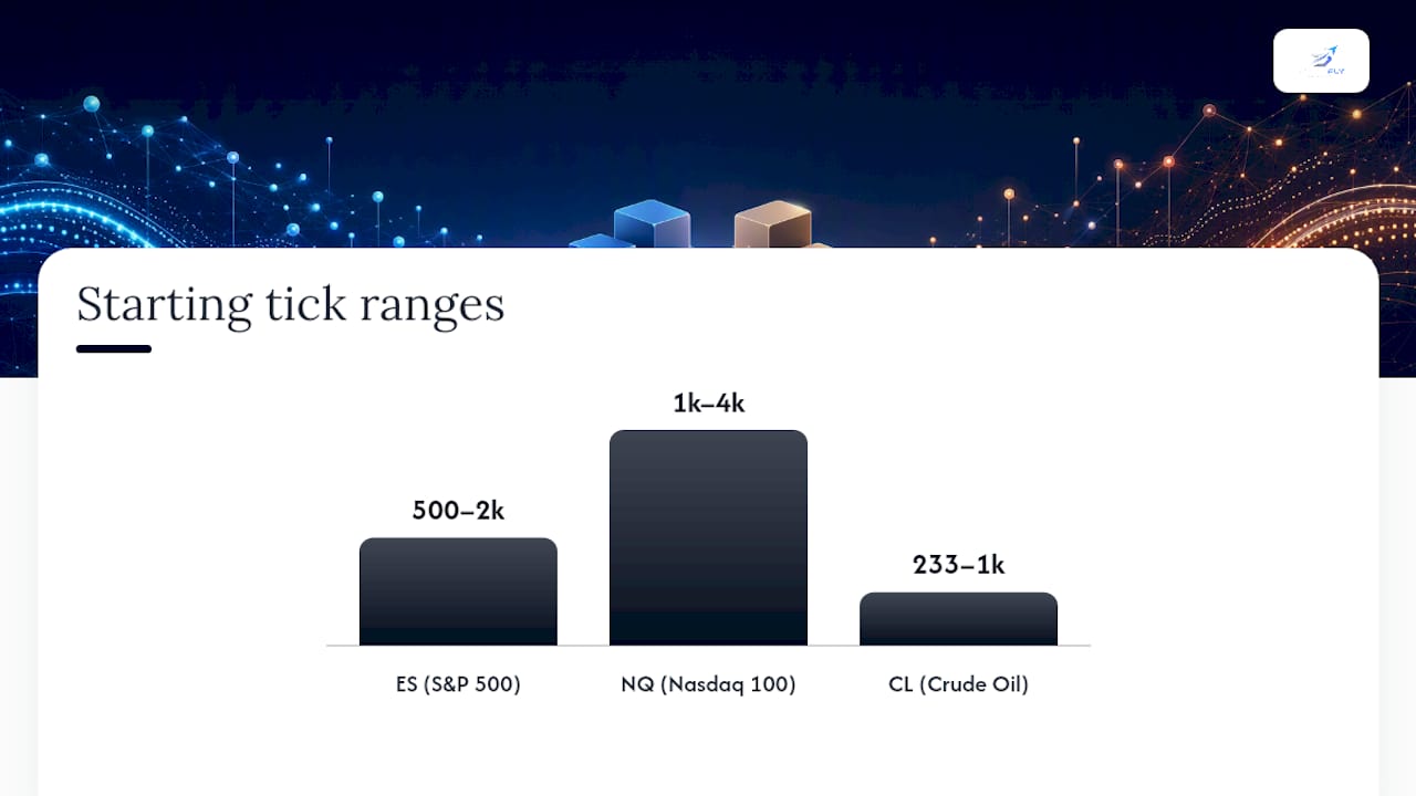
Reasonable starting points for common futures contracts:
- ES (E-mini S&P 500): 500 to 2,000 ticks, adjusted based on how fast bars are printing during your session
- NQ (E-mini Nasdaq 100): 1,000 to 4,000 ticks, since NQ typically sees heavier trade counts than ES because of its higher volatility profile
- CL (Crude Oil): 233 to 1,000 ticks, reflecting crude's generally lower trade frequency compared to equity index futures
Estimating time-per-tick before you commit to a setting saves you from an unpleasant surprise mid-session. During an active morning session, a liquid ES contract might complete a 1,000-tick bar in under a minute. During a slow, low-volatility afternoon, that same 1,000-tick bar could stretch past 10 minutes. Watch your chosen setting across both a busy open and a dead midday stretch before trusting it with real size.
Running paired backtests where you log matched signals across both a tick chart and a time chart gives you the clearest read on which one is preserving your edge. Track signal frequency, entry and exit timestamps, and slippage on both, then compare the results side by side rather than trusting a gut feeling about which "feels" better.
One caution: pushing your tick count too low doesn't make you faster, it makes you reactive to noise. A 100-tick ES chart during a fast open can throw more signals than any discretionary trader can reasonably act on cleanly, which usually ends in overtrading rather than sharper execution.
Recalibrating Indicators for Tick Charts
Standard indicator periods were built around time. A 20-period moving average on a 5-minute chart represents 100 minutes of price action. Put that same 20-period setting on a 200-tick chart and the lookback window now represents a completely different amount of elapsed time depending on how busy the session is. Time-based indicator settings often don't translate directly to tick charts without some rework.
A few practical rules help avoid misreading signals after the switch:
- Test indicator periods empirically rather than porting over your time-chart settings. Run the same 20-period MA at several tick counts and compare how it tracks against known trend turns.
- Favor volume-normalized or order-flow-aware tools over plain time-based oscillators, since they're built with activity in mind rather than a clock.
- Use price action and support/resistance levels as a confirmation layer rather than leaning on a single recalibrated indicator alone.
- Treat RSI and stochastic readings on tick charts with extra skepticism during low-volume stretches, since sparse bars can produce exaggerated readings.
Pro Tip: Start your empirical test by cutting your usual moving-average period roughly in half on a tick chart, then adjust from there based on how it tracks actual reversals over a full session.
Moving averages and ATR bands tend to adapt reasonably well once retested, since they're just measuring dispersion and central tendency over a window. RSI and other momentum oscillators are trickier, because sparse tick bars during quiet periods can distort their readings more than a comparable time-based gap would.
Choosing a Chart Type: A One-Session Test You Can Run Today
Before committing to either chart type full time, run through a short checklist and then validate it with a live, reduced-size session.
- Ask what your average trade duration actually is. If you're in and out within minutes, tick charts likely serve you better. If positions run for hours or days, stick with time charts.
- Check the liquidity of what you trade. Thin instruments punish aggressive tick settings with stalled bars; heavily traded contracts handle them fine.
- Decide whether automation is part of your workflow. Tick-driven signals fire faster and more unpredictably, which matters if a mirroring system is executing trades on your behalf.
- Set up matched signals on both chart types for one session. Use the same entry criteria, reduced position size, and log every trigger, fill, and exit.
- Compare the resulting edge metrics. Win rate, realized reward-to-risk, and slippage will usually tell you clearly which chart preserved your actual trading edge that day.
- Apply risk controls throughout the test, including a hard size cap and a daily loss lock, since day trading carries risks that get amplified when you're also testing an unfamiliar setup.
- Keep both charts in rotation once you've decided. Most experienced intraday traders don't fully abandon one for the other. A time chart for context and a tick chart for execution timing is a common, durable combination.
Practitioner Notes on Chart Choice and Automated Execution
Arturo's take, drawn from watching how traders actually integrate charting decisions into live execution: chart choice stops being theoretical the moment automation enters the picture. A tick chart firing signals faster than a human can react is exactly the scenario where broker-side protective stops matter most, since a dropped connection during a fast tick-driven sequence shouldn't leave a position unprotected.
The operational checklist here is short but non-negotiable. Test any tick-based strategy at reduced size before scaling up. Enforce a daily profit and loss lockout so a string of tick-chart signals fired in a volatile stretch can't spiral into an outsized loss. And run at least one forced-disconnect test during setup, confirming that protective stops execute as expected even when a fast tick sequence is mid-trade.
For traders running multiple Tradovate accounts off tick-chart signals, the mirroring and stop-placement logic needs to keep pace with however fast your chosen tick setting fires. Details on how that mirroring and protective-stop workflow functions are covered on SafeFly's how it works page, and traders testing tick settings against real order-flow context may find the analytics on SafeFly's market data tools useful for narrowing down a starting tick count faster than trial and error alone.
What Matters Most When You Actually Switch Chart Types
The research here supports a conclusion most traders resist: chart type is a testing decision, not a philosophy. Too many traders pick tick charts because they sound more "professional" and then wonder why their old indicator settings produce garbage signals. The mismatch isn't the chart's fault. It's a failure to retest.
Conventional advice tends to oversell tick charts as a scalping silver bullet. They're not. They're a tool that trades noise reduction during busy periods for unpredictable bar timing during quiet ones, and that tradeoff only pays off if your instrument has the liquidity to support it. A tick setting that works beautifully on ES can leave you staring at a frozen chart on a thinner contract.
If you take one thing from this, prioritize the paired-session test over any recommended starting tick count, including the ones in this piece. Numbers by instrument are a starting point, not a verdict. Your own logged edge metrics, measured across a real session on both chart types, are the only data that actually tells you which one is working for how you trade.
— Arturo
Sources
For readers who want to go deeper on the mechanics and testing methods covered here, a few sources are worth bookmarking. TradingSim's guide to tick charts breaks down bar formation and indicator recalibration in more depth. TradingView's support documentation covers the technical side of tick-based intervals and timestamp behavior. Benzinga's comparison piece lays out the tick-versus-time tradeoff clearly, Optimus Futures offers practical tick-count guidance by instrument, and the SEC's day-trading risk publication is essential reading before testing any faster execution style with real capital.
- Tick Charts Explained: A Day Trader's Guide | TradingSim
- TradingView support — What are tick-based intervals?
- Tick Charts vs. Time Charts: Which is Better? • Benzinga
- Day trading: Your dollars at risk — SEC
- An Introduction to Tick Charts and How to Trade Them in Futures Markets — Optimus Futures